Brand Identity for Fiora.
A garden-inspired brand identity for a hypothetical Italian restaurant. Fiora blends soft florals, Italian elegance, and a hand-drawn logo for a vibrant, artisanal feel.
About the Project
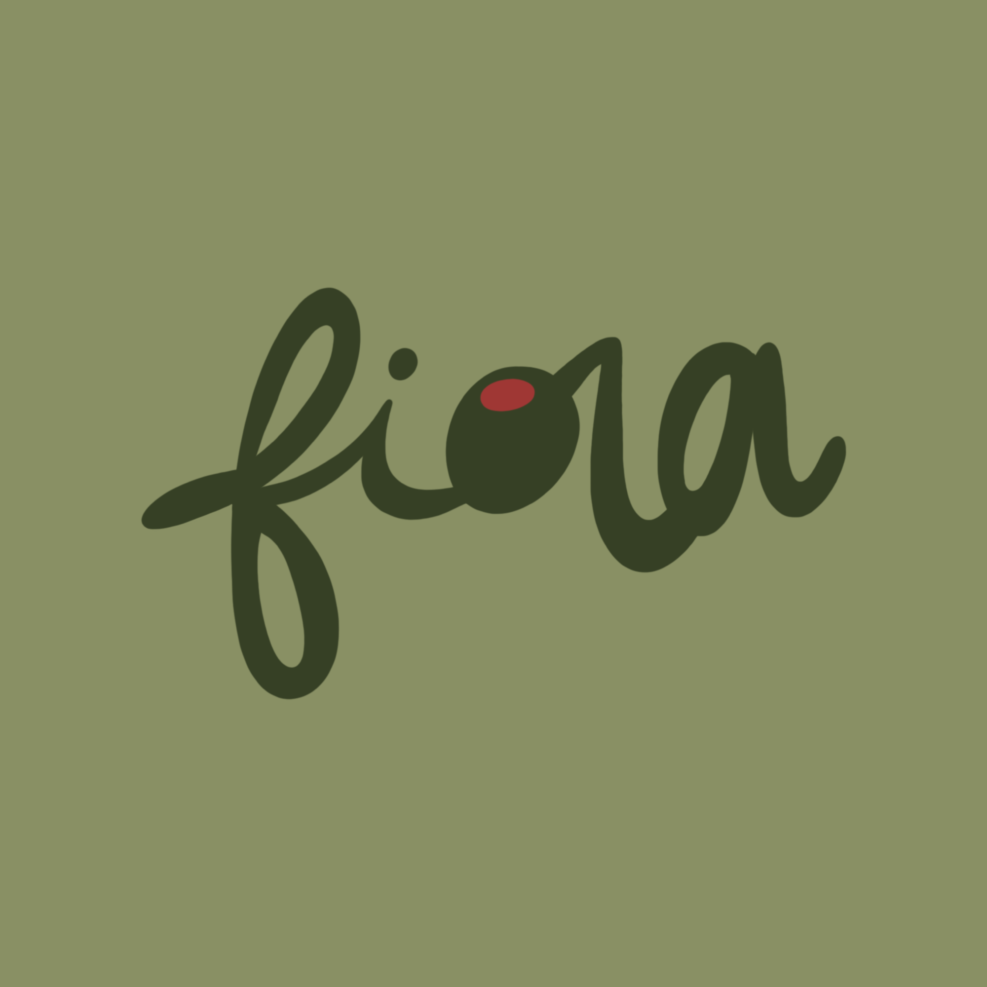
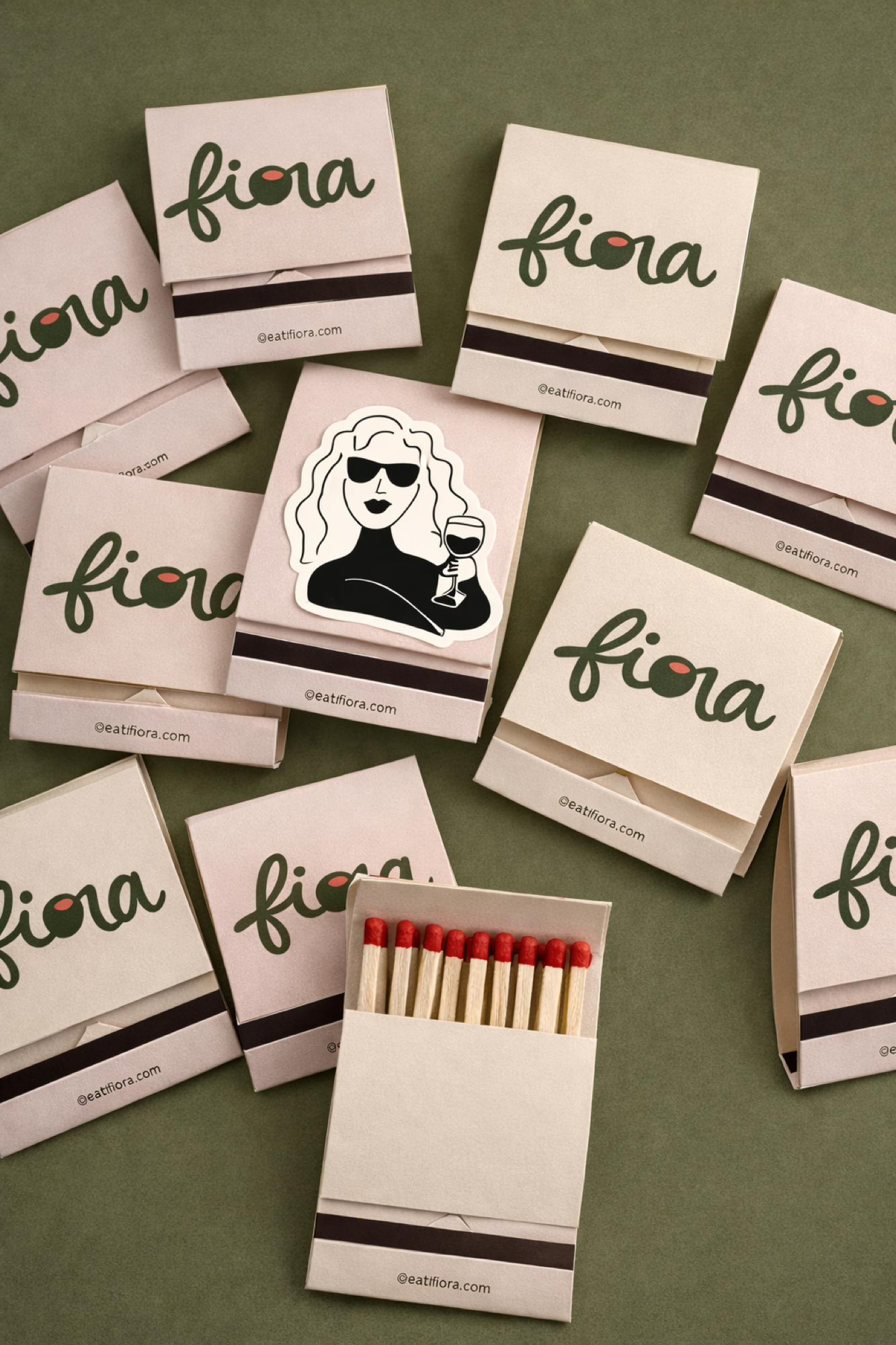
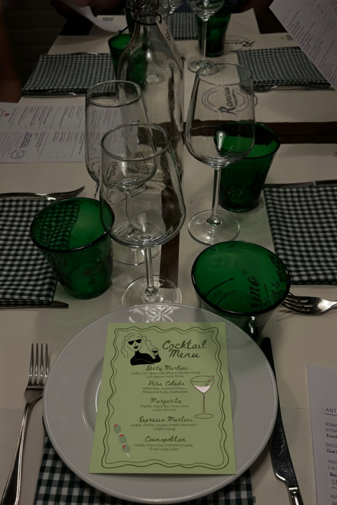
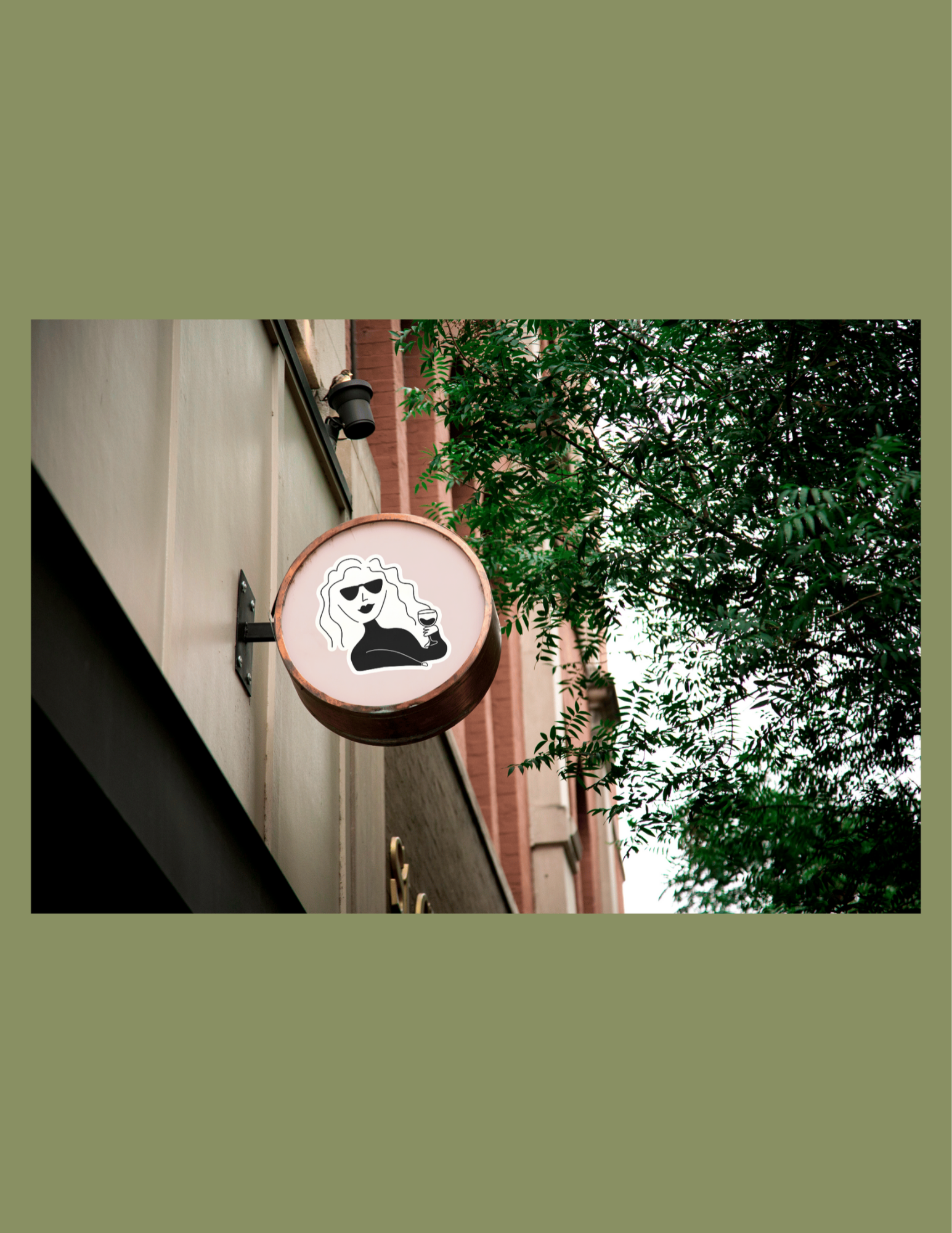
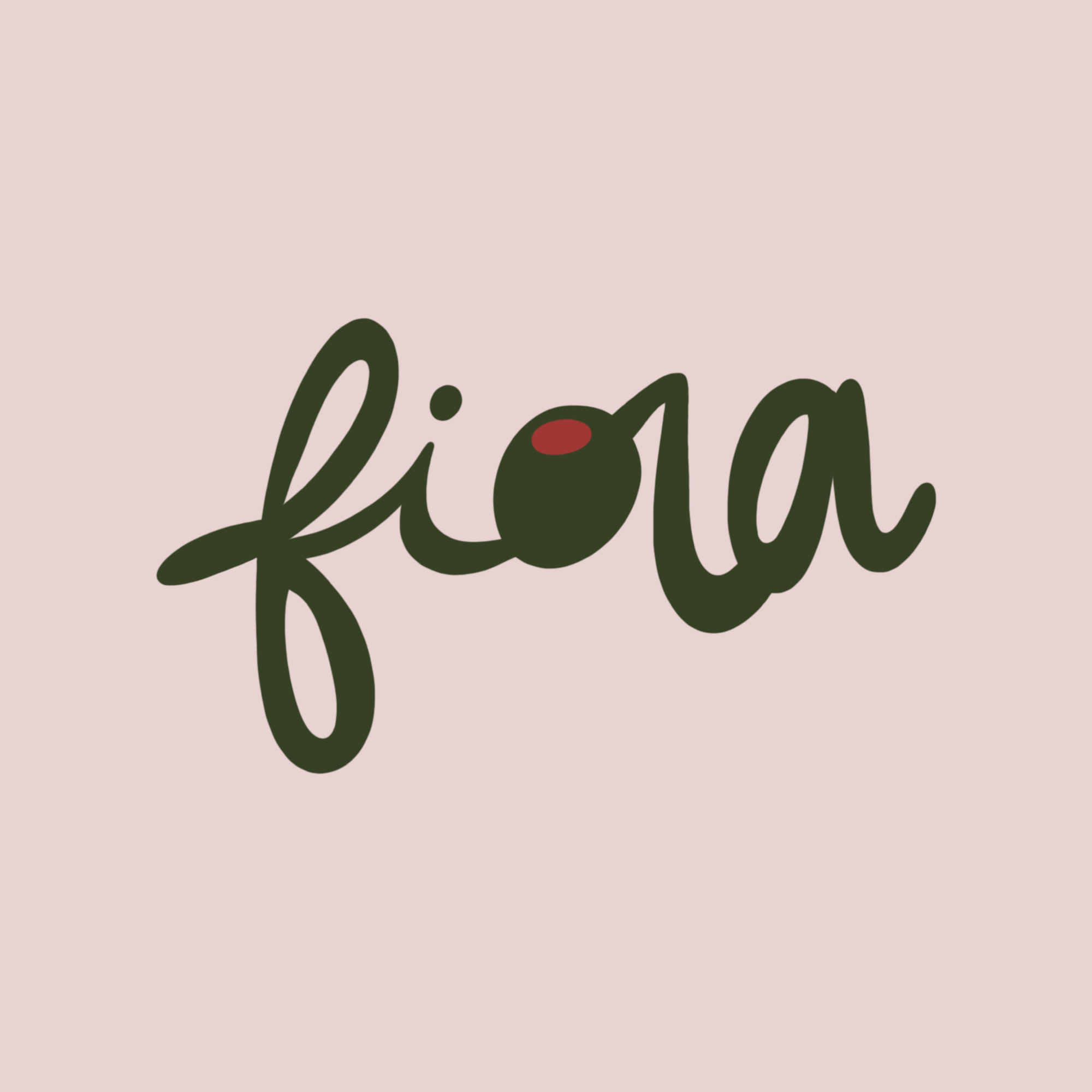
For one of my most recent projects, I developed a full brand identity for a hypothetical Italian restaurant, Fiora. The concept was inspired by the idea of a whimsical Italian garden, using soft greens and warm pinks to evoke the colors of blooming flowers. In Italian, “Fiora” translates to “flower,” “to bloom,” and “vibrant,” and I wanted every element of the brand to embody that sense of natural beauty, growth, and charm.
The logo was hand-drawn using Procreate, allowing me to create a more organic and expressive design. I enjoy designing logos by hand because it adds a personal quality that can’t always be achieved with premade fonts, helping the brand feel thoughtful, authentic, and uniquely crafted.
View on Instagram →