Campaign Design for Ocha.
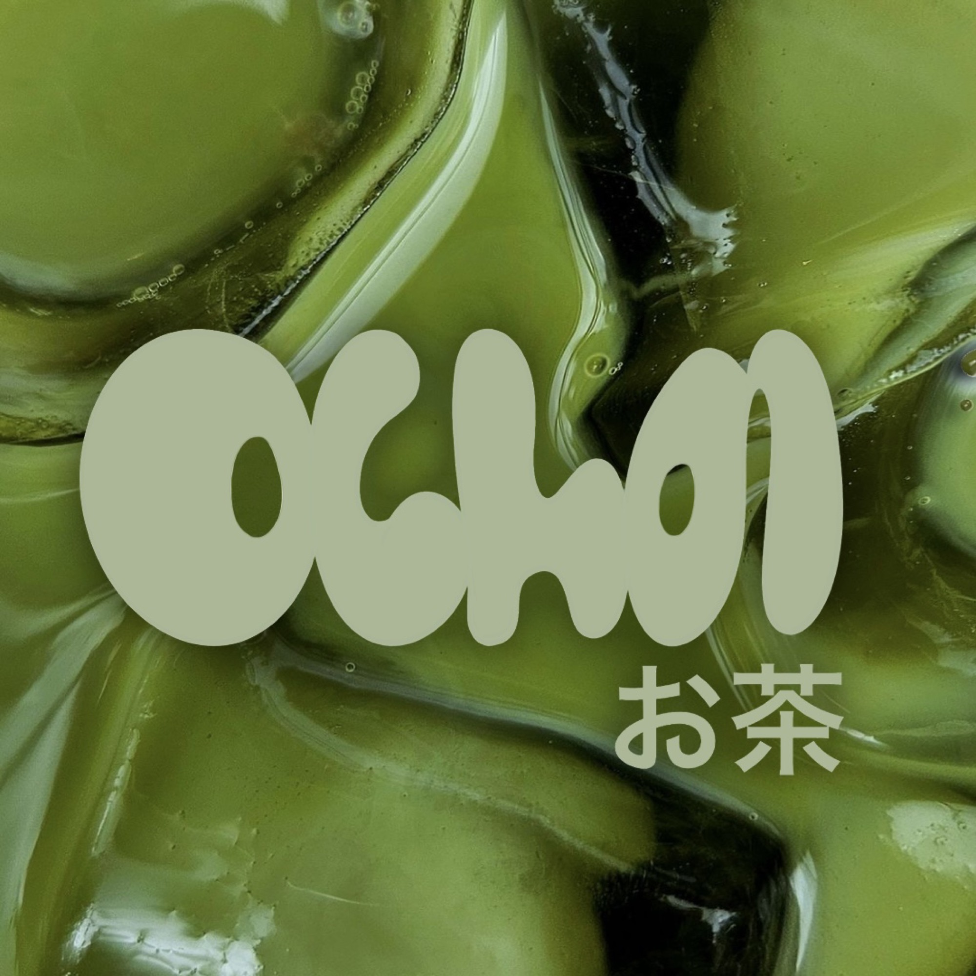
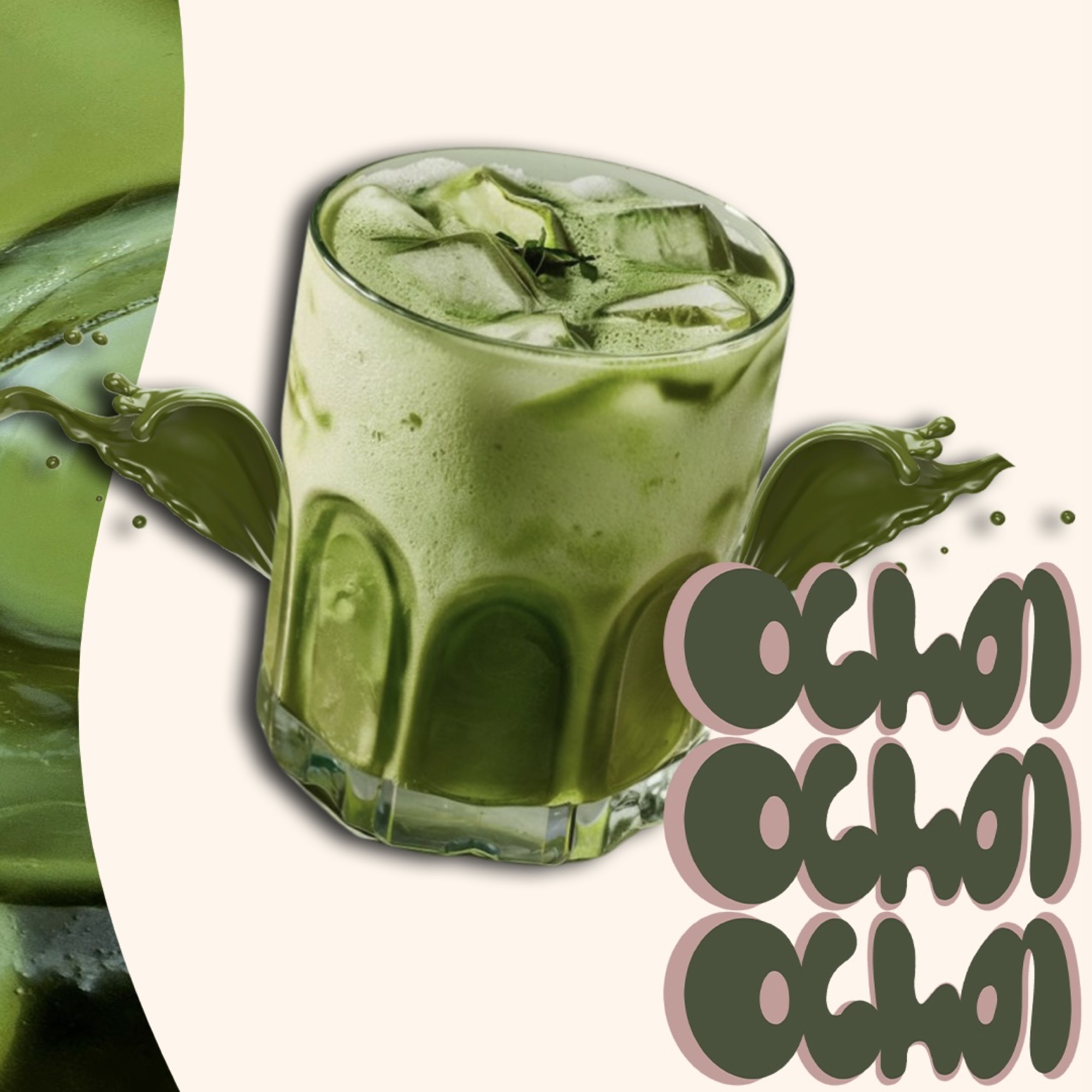
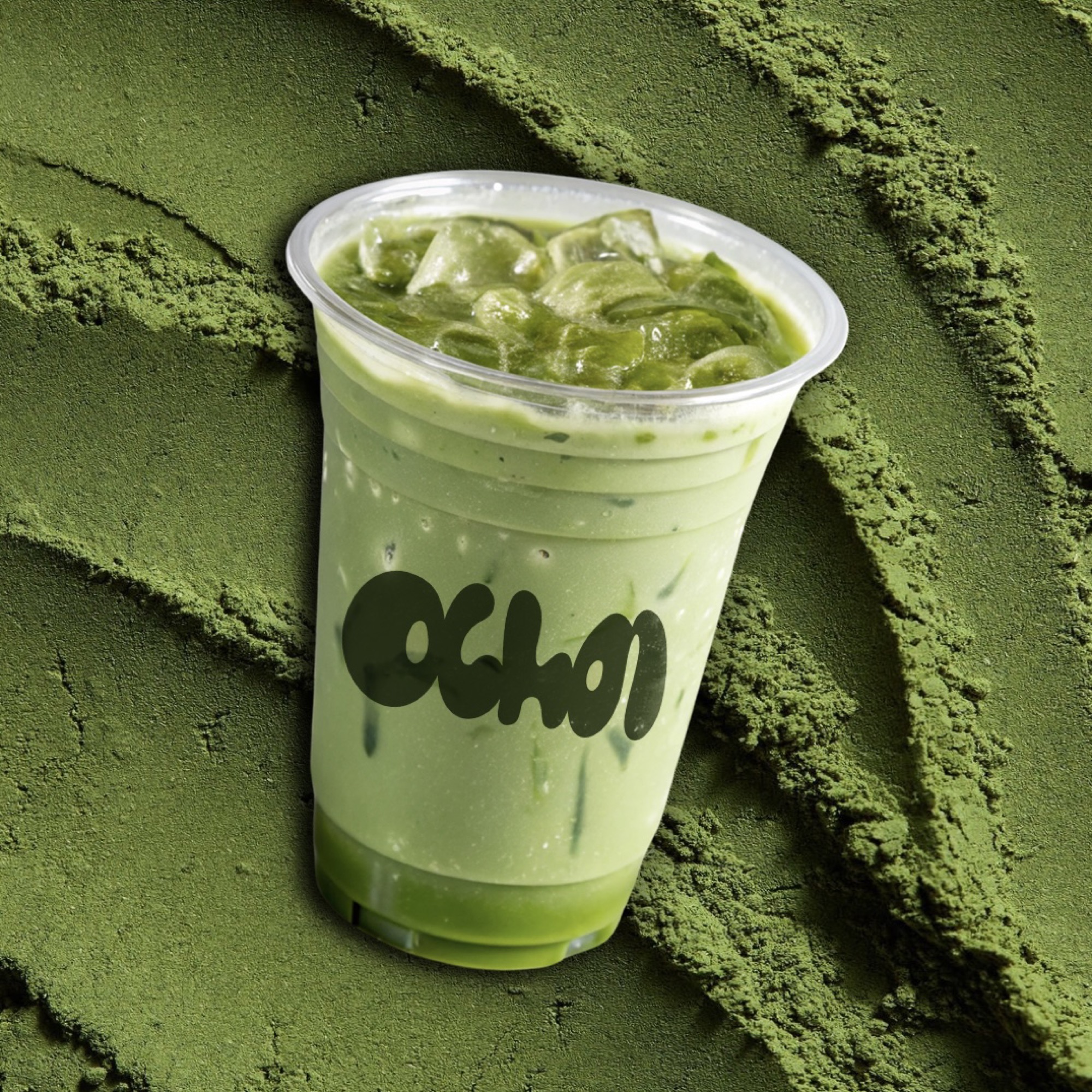
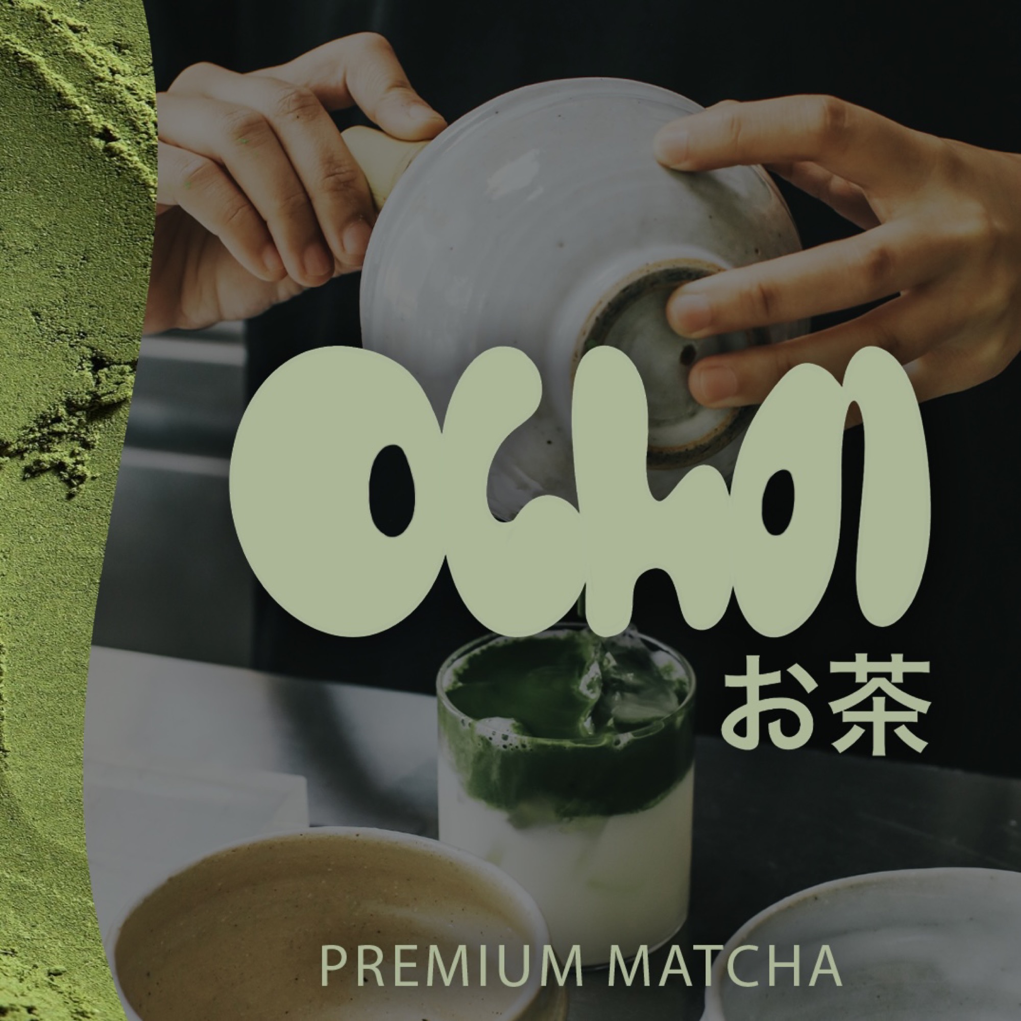
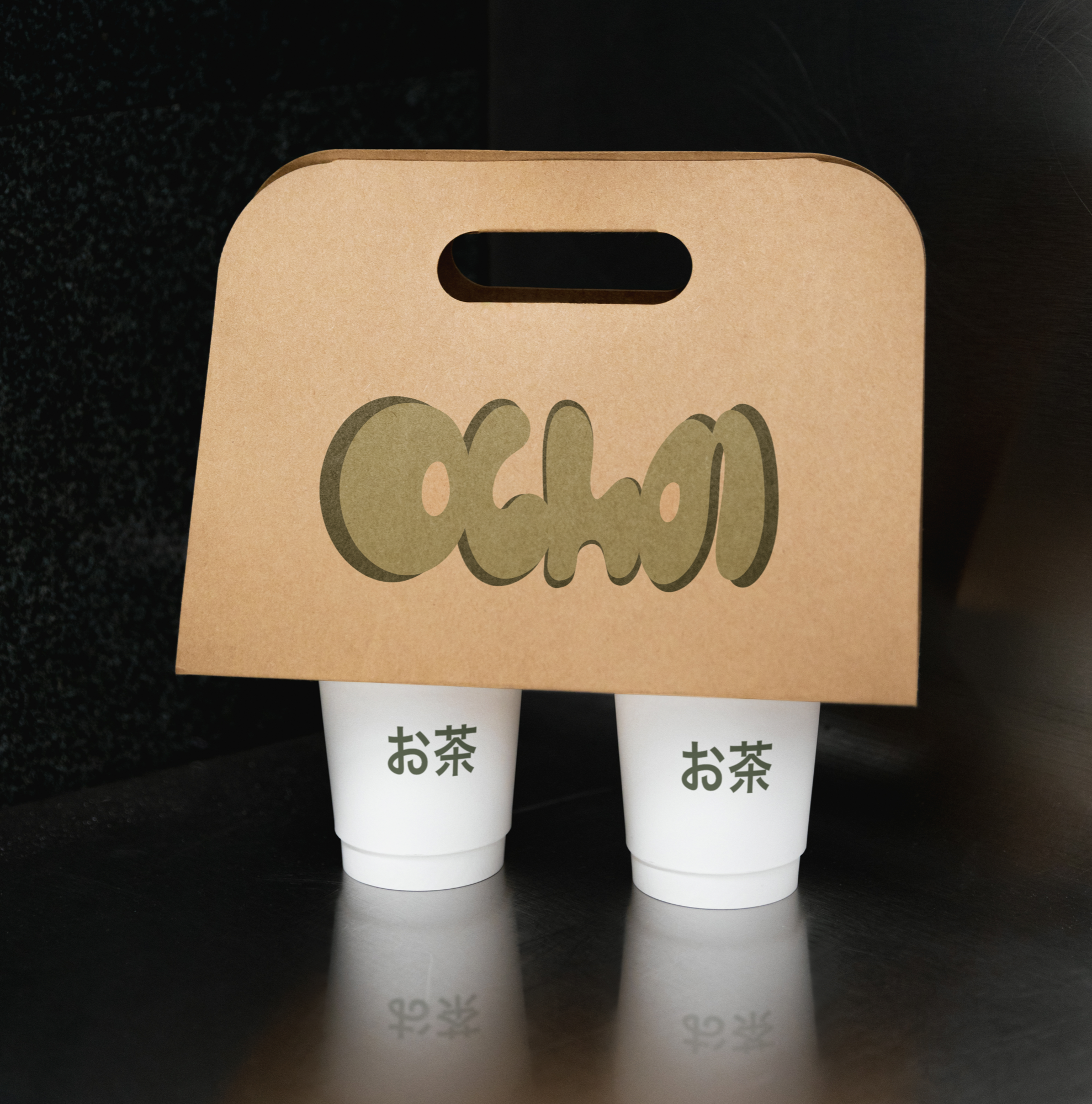
Ocha is a minimalist matcha brand inspired by the calming ritual of tea drinking. With soothing green tones and a clean, modern aesthetic, the brand captures the serenity and elegance of Japanese matcha culture.
About the Project
Ocha is one of my favorite projects to date. As a longtime matcha enthusiast, I created a brand centered around this beloved green tea, drawing inspiration from its Japanese origins. The name Ocha directly translates to “tea,” and more specifically, “green tea,” capturing the essence of the product itself. Matcha, with its finely ground, shade-grown leaves, has a ritualistic and meditative quality, and I wanted the brand to reflect that experience.
The visual identity leans into calming shades of green, evoking the serene, restorative feeling of enjoying a cup of matcha. I designed the brand to be clean, minimal, and modern, emphasizing simplicity while highlighting the elegance and tranquility inherent in tea culture. Through Ocha, I aimed to create a brand that feels both approachable and mindful, inviting people to slow down and savor the moment.
View on Instagram →